Sips & Sparks is a speed-dating service used to connect others. Matches between others and notes are collected through a mobile match form during the event, but has brought some confusion to users. The new match form seeks to alleviate these frustrations and create a seamless experience.

For this project, I was tasked with redesigning the match form for Sips & Sparks, a speed dating business, utilizing Figma to complete this task.
Duration: 3 months
In the world of online dating, Sips & Sparks seeks to connect others through real world interaction. Participants during the speed dating events record notes of others on the match form provided through their phone and select their matches through the form as well. As participants have utilized the platform they have ran into confusion on how to properly submit this information, thus resulting in interviews and a redesign of the match form. Common questions/difficulties from participants include:
To solve the following problems, the match form will focus on a more seamless experience to avoid participant confusion.
The first step was visiting an event! Analyzing participant behavior and feedback during the event provided me with identifying the problems and taking the necessary steps to blueprint a new design. The changes for the match form would include:
Implementing Screens: The usage of screens would divide information reducing confusion
Captions: Captions and short text on divided screens explain the purpose and function of the task the participant is meant to complete
Integrating Matches with Notes: Notes will be placed under participant names associating the information with one person at a time
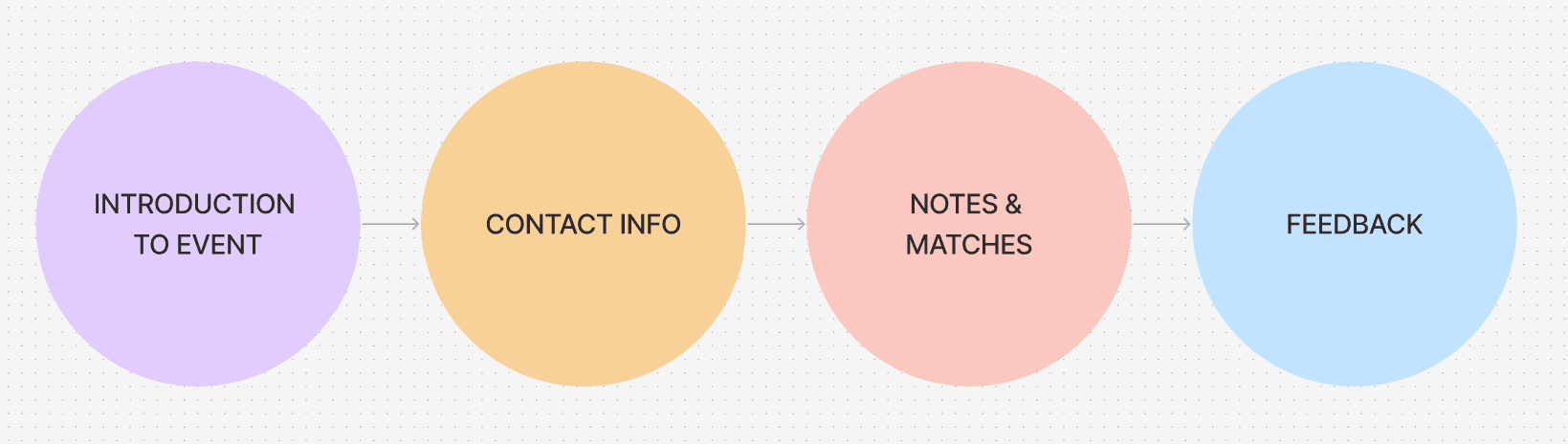
This user flow represents the division of information correlated to screens.
These are the wireframes of the match form.


These are the wireframes of the match form.

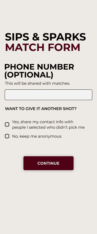


After receiving feedback on the first design, a few problems were identified.
Sharing Information with Other Attendees: Participants were having trouble understanding the process in sharing contact information with those they matched with and those in which they selected without receiving a match.
Notes & Selections: Participants would like to know who they are talking with utilizing a photo on the page. Trouble with moving on to new participant.
Easier Feedback Form: Participants were writing feedback, but there needed to be a way for them to be a bit more clear.
More Pizzazz!: Bring more of the brand feel into the match form.

Through this project, I was able to learn in a real-life setting about a business and what its consumer base needs.
Ease of Usage
Creating a simple, easy to comprehend and clear interface was essential to remedy participant problems.
Participants were first very confused on how to select matches and complete the process. As speed-dating is a fast-paced interaction, it was very important to listen to the participant frustrations and create a match form that would complete interactions in a timely manner.
Securing Feedback
Creating a feedback form for participants to dicusses the event process immediately after the event helped with reiterating on the design.
Without the feedback form it would be hard to evaluate the difficulties presented in-person and how the digital match form would be able to remedy these issues.